Oneworld Accuracy is proud to introduce new graphs and stats to your quantitative reports to help participants visualize and better understand their evaluations. These new graphs will provide a better visualization of the outcomes, relationships and trends of the results provided on the performance reports.
We are also introducing a new statistic called the PAD (Percentage of Allowed Deviation) Score. As many of our analytes have evaluation criteria of a peer group mean + or – a percentage of the mean or fixed amount based on biological variation, we added the PAD score to provide you with a metric that will show your deviation from the target that will be more meaningful than the SDI for analytes not evaluated with the SD. Please look out for the new PAD Score for analytes with an evaluation criterion other than Peer group mean + or – SD.
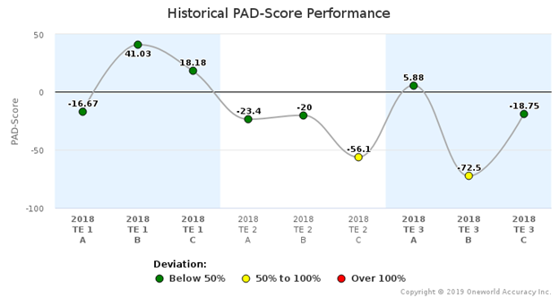
The PAD score is calculated by this formula: (Difference between participant’s result and target value/evaluation limit) x 100. PAD scores of the current test event as well as previous test events (if available) will be graphed, for every sample and analyte. You will also see the new PAD Score graph shown below.

There will be a horizontal bar usually with a scale of -100 to 100 with a marker showing the PAD score of the participant and a color change relating to the following:

The Historical PAD Score graph will be shown by analyte for one year’s worth of data to allow you to easily see trends developing. As similar graph is also provided for the Z-score.
For analytes that are evaluated using the SD in the evaluation criteria, you will notice that we are providing the Z-score. Z-score is calculated according to this formula: (Difference between participant’s result and target value/1 standard deviation). Z scores of the current test event as well as previous test events (if available) will be graphed, for every sample and analyte, as shown below.
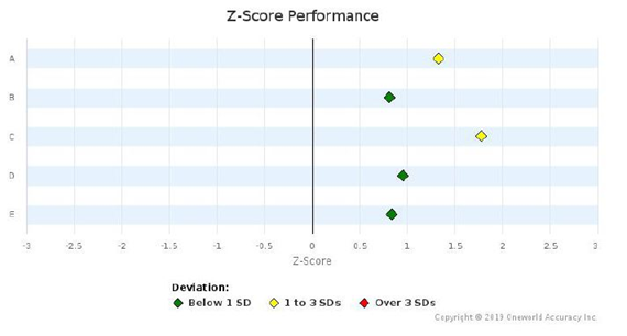
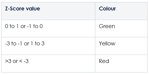
The graph will have a scale from -evaluation limit to +evaluation limit (usually 2 or 3 SD)For example, if the evaluation limit is 3 SD, the scale will be -3 to 3 with any score outside of 3 appearing just outside of 3 but not to scale. Colors for the markers will be:
And finally, our new Performance by Concentration graph, which show your result in relation to the acceptable range on a linear line relating to the concentration of the sample. This graph will provide a visual representation of any trends developing with results at particular concentrations.
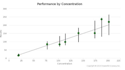
The vertical lines extending from the linear regression line indicate the acceptable ranges, while the markers indicate the participant’s results in relation to their positions within the ranges.
Our qualitative reports will see graphs in 2020.
If you would like a further explanation of the new graphs and statistics, please visit our tutorials in our support center https://oneworldaccuracy.zendesk.com/hc/en-us or contact our support team and support@1wa.org. We also look forward to any feedback you might have on our new reports.
Comments